#bootstrap navigation
Explore tagged Tumblr posts
Visit Tumblr Blog
Explore Tumblr blogs with no restrictions, modern design and the best experience.
Last Seen Tumblr Blogs


Fun Fact
Tumblr Inc. is funded by 13 investors.
Text
Bootstrap navigation ( Nav bar )
We will move in compliance with the arrangement of the elements in standard html projects from top to bottom. The first element that we study - the navigation bar.
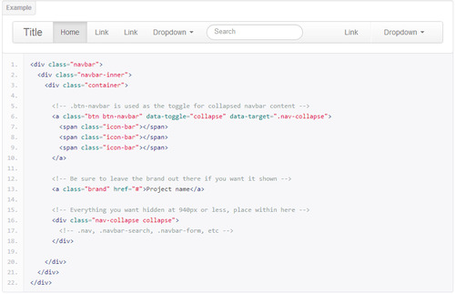
For a review of this element read the information on the official site http://twitter.github.io/bootstrap/components.html#navbar . We will consider in more detail especially nav bar.
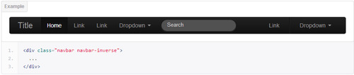
Bootstrap provides two basic colors of navbar light and inverted black. Here class to add if you need black navbar
.navbar-inverse
Also, if you want to fix the navigation at the top of the page when scrolling navigation that remained in place, apply the class class="navbar navbar-fixed-top" You can see a live example of a navigation on this site.
More examples: Static nav bar | Fixed nav bar
You can also fixed nav bar at the bottom of the active window to do this apply class class="navbar navbar-fixed-bottom"
Bootstrap menu adapted for mobile devices. On mobile devices, display links to navigate change, there is a drop down menu. To use it you need the following code

On mobiles and tablets.
When you click on the button - menu opens

When you create a one-page site with scrolling the screen when you click on a menu item, the default menu bootstrap remains open. To change this, use javascript(jQuery) code
<script>$('.nav-collapse .nav > li > a').click(function(){
$('.collapse.in').removeClass('in').css('height', '0');
});</script>
Here you can see live example
By default, the bootstrap fixed menu has one peculiarity to be shown on mobile - changing from a fixed to a static display
@media (max-width: 979px){ .navbar-fixed-top, .navbar-fixed-bottom { position: static; } }
To fix this we need to change following style
@media (max-width: 979px){ .navbar-fixed-top, .navbar-fixed-bottom { position: fixed; } }
Change navbar colors and styles
To change navbar menu colors, add style at the bottom of a file in the page header bootstrap.css For e.g.
.navbar-inner { background: #2b2b2b; background-image: none; background-repeat: repeat-x; border-color: none; filter: none; }
Change navbar height
To change navbar height change value min-height: 40px;
.navbar-inner { min-height: 40px; /* change value here*/ }
Change the color of navbar links
You can change the color of menu links replace the code in styles
.navbar-inverse .brand, .navbar-inverse .nav > li > a { color: #999999;/* CHANGE COLOR HERE*/ text-shadow: 0 -1px 0 rgba(0, 0, 0, 0.25); } .navbar .nav > li > a { float: none; padding: 10px 15px 10px; /* CHANGE HEIGHT HERE */ color: #777777; /* CHANGE COLOR HERE*/ text-decoration: none; text-shadow: 0 1px 0 #ffffff; }
5 notes
·
View notes
Text
Responsive React Sidebar Navigation
Responsive React Sidebar Navigation
Responsive React Sidebar Navigation Responsive React Sidebar Navigation is a React-based Vertical Navigation with customizing options. It can be used for all types of web applications like custom admin panel, project management system, admin dashboard, backend application. It’s lightweight and compatible with almost all major browsers and devices Features Built on pure React JS,JQuery not…

View On WordPress
#asidebar menu#asidebar navigation#bootstrap dropdown menu#bootstrap navigation#bootstrap sidebar menu#dropdown menu#dropdown menu react#mobile menu#Navigation#react dropdown menu#react navbar#React Navigation#react navigation bar#react sidebar menu#reactjs#sidebar menu
0 notes
Text
Bootstrap navigation
Bootstrap Navigation
Basic Navigation
.nav
.nav-item
.nav-link
.nav-tabs
.nav-pills
.nav-fill
.nav-justified
Ex:
<head>
<link rel=”stylesheet” href=”../node_modules/bootstrap/dist/css/bootstrap.css”>
http://â../node_modules/jquery/dist/jquery.jsâ
http://â../node_modules/bootstrap/dist/js/bootstrap.bundle.jsâ
</head>
<body>
View On WordPress
0 notes
Text
New Post has been published on 1Nulled.Com - Free Premium WordPress Themes & Plugins
New Post has been published on https://www.1nulled.com/meganavbar-v2-2-0-advanced-mega-menu-for-bootstrap-3-0/
MegaNavbar v2.2.0 – Advanced Mega Menu for Bootstrap 3.0+
<!-- if(wpa2a)wpa2a.script_load(); //-->
MegaNavbar – Advanced Mega Menu for Bootstrap 3.0+ free download
MegaNavbar – create beautiful MegaMenu navigation for your site
MegaNavbar is pure HTML5/CSS3 navigation component, that use the standard navbar markup, and the fluid grid system classes from Bootstrap 3. Work for fixed and responsive layout, and has the facility to include other Bootstrap components. MegaNavbar is compatible with mobile devices and modern web browsers.
2015.02.10 - Version 2.2.0 was updated. (The code was not changed, just the demo package was included)
#bootstrap#bootstrap menu#bootstrap navbar#bootstrap navigation#drop down menu#dropdown menu#horizontal menu#html5 menu#mega menu#megamenu#meganavbar#menu css3#navigation menu#responsive#responsive menu
0 notes
Text
X-Nav > Multi Level Navigation system (Navigation and Menus)
X-Nav > Multi Level Navigation system (Navigation and Menus)
Purchase $7.00 X-Nav is a Dropdown Megamenu with image Slider,Youtube and Vimeo Video Playing options and usual navigations. 1. Functional Dropdown 2. Youtube and Vimdeo Video playing Options, 3. Responsive image slider with BX Slider, 4. Easy navigation with functional design, 5. Retina ready, 6. Coded with SASS, 7.Included all the SASS files to better your customisation, 8. Easy…
View On WordPress
#bootstrap navigation#drop down#drop down menu#flexible navitgation#mega menu#menu#multi dropdown#multi menu#navigation#vimeo player#x nav#youtube player
0 notes
Text
A2Z - Bootstrap Responsive Mega Menu for Template (Navigation)
A2Z – Bootstrap Responsive Mega Menu for Template (Navigation)
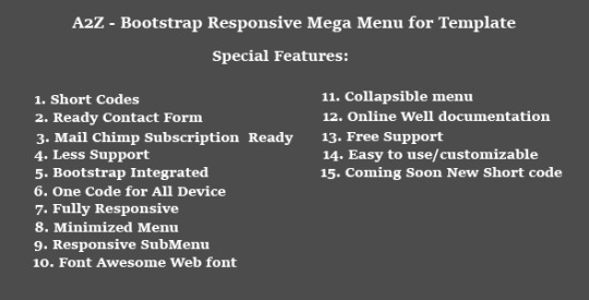
Purchase $6.00 A2Z – Bootstrap Responsive Mega Menu for Template. A2Z Mega menu make short codes for multi usages and multiple templates. All features are included in A2Z mega menu. Short codes make user friendly code and easily customizable and easily change Short Codes. Unique Feature 1. Contact Form Ready 2. Mail Chimp Integrated Subscribe Form 3. Online Well Documentation 4. Short Codes for…
View On WordPress
#bootstrap mega menu#bootstrap navigation#Clean#dropdown menu bootstrap#jquery responsive mega menu#mega menu#Mobile friendly mega menu#mobile menu#responsive css menu#Responsive drawer menu#responsive megamenu#responsive menu#responsive navigation#Responsive slide menu#responsive website mega menu
0 notes
Text
Download A2Z - Bootstrap Responsive Mega Menu for Template (Navigation)
Live Demo and Download A2Z - Bootstrap Responsive Mega Menu for Template (Navigation)
#bootstrap mega menu#bootstrap navigation#Clean#dropdown menu bootstrap#jquery responsive mega menu#mega menu#Mobile friendly mega menu#mobile menu#responsive css menu#Responsive drawer menu#responsive megamenu#responsive menu#responsive navigation#Responsive slide menu#responsive website mega menu
0 notes
Text
New Post has been published on Html Use
New Post has been published on http://www.htmluse.com/responsive-bootstrap-sidebar-navigation/
Responsive Bootstrap Sidebar Navigation
Download Demo
Responsive Bootstrap Sidebar Navigation
Multi purpose Responsive Bootstrap Sidebar Navigation Ready to be used in Web Apps
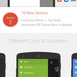
HOE Navigation Menu consist of both Horizantal and Vertical navigation menu based on CSS3 and Jquery. Its lightweight and compatible with almost all major browsers and devices. It supports four levels sub menu with shrink, Overlay and push effect.
Features included:
Fully Responsive ready for Desktop, Tablets and Mobile
One Code for all devices
Modern application style navigation
Drop Down menu bootstrap
Push Menu Effects Menu with jQuery and CSS3
Shrink Menu Effects with jQuery and CSS3
overlay Menu Effects with jQuery and CSS3
vector Icons – Font Awesome version 4.3
Multiple Color options
Bootstrap 3+ based
Responsive horizontal Bootstrap navigation
Responsive horizontal Compact Bootstrap menu
Collapsible Mobile menu
sticky sidebar
Documentation
live demo
Dependencies
jQuery: Any higher version of jQuery library
Bootstrap CSS Library
FontAwesome Font: Free open source font library for icons
Google Font: Lato Webfont is used for the typography
html5shiv.js and respond.min.js for IE9 and older version Support
#admin menu#bootstrap navigation#bootstrap sidebar menu#dashboard sidebar#featured#html sidebar#Mobile friendly sidebar#off-canvas responsive menu#off-canvas sidebar#overlay responsive sidebar#responsive css menu#responsive horizontal menu#responsive navigation#Responsive sidebar navigation#Responsive slide menu#Bootstrap#Bootstrap plugins#Css / Css3 Plugins & Demos#HTML / HTML5 Plugins & Demos#Jquery Plugins & Demos#Menu & Navigation#Responsive
0 notes
Text
A2Z - Bootstrap Responsive Mega Menu for Template (Navigation)
A2Z – Bootstrap Responsive Mega Menu for Template (Navigation)

Purchase $6.00 A2Z – Bootstrap Responsive Mega Menu for Template. A2Z Mega menu make short codes for multi usages and multiple templates. All features are included in A2Z mega menu. Short codes make user friendly code and easily customizable and easily change Short Codes. Unique Feature 1. Contact Form Ready 2. Mail Chimp Integrated Subscribe Form 3. Online Well Documentation 4. Short Codes for…
View On WordPress
#bootstrap mega menu#bootstrap navigation#clean#dropdown menu bootstrap#jquery responsive mega menu#mega menu#Mobile friendly mega menu#mobile menu#responsive css menu#Responsive drawer menu#responsive megamenu#responsive menu#responsive navigation#Responsive slide menu#responsive website mega menu
0 notes
Text
Responsive Bootstrap Sidebar Navigation (Navigation)
Responsive Bootstrap Sidebar Navigation (Navigation)

Purchase $6.00 Multipurpose Responsive Bootstrap Sidebar Navigation Ready to be used in Web Apps HOE Navigation Menu consist of both Horizantal and Vertical navigation menu based on CSS3 and Jquery. Its lightweight and compatible with almost all major browsers and devices. It supports four levels sub menu with shrink, Overlay and push effect. Features included: Fully Responsive ready for Desktop,…
View On WordPress
#admin menu#bootstrap navigation#bootstrap sidebar menu#dashboard sidebar#html sidebar#Mobile friendly sidebar#off-canvas responsive menu#off-canvas sidebar#overlay responsive sidebar#responsive css menu#responsive horizontal menu#responsive navigation#Responsive sidebar navigation#Responsive slide menu
0 notes
Text
Download Responsive Bootstrap Sidebar Navigation (Navigation)
Live Demo and Download Responsive Bootstrap Sidebar Navigation (Navigation)
#admin menu#bootstrap navigation#bootstrap sidebar menu#dashboard sidebar#html sidebar#Mobile friendly sidebar#off-canvas responsive menu#off-canvas sidebar#overlay responsive sidebar#responsive css menu#responsive horizontal menu#responsive navigation#Responsive sidebar navigation#Responsive slide menu
0 notes
Text
Web Slide - Responsive Mega Menu for Bootstrap 3+ (Navigation)
Web Slide – Responsive Mega Menu for Bootstrap 3+ (Navigation)

Purchase $7.00


Off Canvas – Responsive Mega menu
Web Slide – Off Canvas Menus are used primarily with Mobile and touch devices. It provides a modern application style navigation look in your website
Powerfull Feature: One Code for all devices
100% Responsive Mega Menu
Modern app style navigation
Compatible: Bootstrap 3.0 + Megamenu
Font Awesome Included: fully vector Icons
Responsive…
View On WordPress
#bootstrap mega menu#bootstrap navigation#dropdown menu bootstrap#jquery responsive mega menu#mega menu#Mobile friendly mega menu#mobile menu#off-canvas responsive menu#responsive css menu#Responsive drawer menu#responsive megamenu#responsive menu#responsive navigation#Responsive slide menu#responsive website mega menu
0 notes
Text
Web Slide - Responsive Mega Menu for Bootstrap 3+ (Navigation)
Web Slide – Responsive Mega Menu for Bootstrap 3+ (Navigation)
Purchase $7.00
Off Canvas – Responsive Mega menu
Web Slide – Off Canvas Menus are used primarily with Mobile and touch devices. It provides a modern application style navigation look in your website
Powerfull Feature: One Code for all devices
100% Responsive Mega Menu
Modern app style navigation
Compatible: Bootstrap 3.0 + Megamenu
Font Awesome Included: fully vector Icons
Responsive…
View On WordPress
#bootstrap mega menu#bootstrap navigation#dropdown menu bootstrap#jquery responsive mega menu#mega menu#Mobile friendly mega menu#mobile menu#off-canvas responsive menu#responsive css menu#Responsive drawer menu#responsive megamenu#responsive menu#responsive navigation#Responsive slide menu#responsive website mega menu
0 notes
Text
Download Web Slide - Responsive Mega Menu for Bootstrap 3+ (Navigation)
Live Demo and Download Web Slide - Responsive Mega Menu for Bootstrap 3+ (Navigation)
#bootstrap mega menu#bootstrap navigation#dropdown menu bootstrap#jquery responsive mega menu#mega menu#Mobile friendly mega menu#mobile menu#off-canvas responsive menu#responsive css menu#Responsive drawer menu#responsive megamenu#responsive menu#responsive navigation#Responsive slide menu#responsive website mega menu
0 notes
Text
New Post has been published on Html Use
New Post has been published on http://www.htmluse.com/meganavbar-advanced-navbar-for-bootstrap-3-0/
MegaNavbar. Advanced Navbar for Bootstrap 3.0+
Download Demo
The MegaNavbar is a Bootstrap 3.0+ based component, that uses the standard navbar markup, and the fluid grid system from Bootstrap 3. Work for fixed and responsive layout, and has the facility to include any Bootstrap component except dropdown. MegaNavbar is compatible with mobile devices and modern web browsers.
The MegaNavbar have 100% responsive layout design and retina display ready with Font Awesome Icons Included! You can use Bootstrap column grid system with this component also you can use custom widgets like videos, Google Maps, text widgets, tables, forms, media elements, carousel elements, buttons and so more…
Key Features:
100% Responsive Layout Design
Bootstrap Columns Grid based
Unlimited Color Schemes
Easy integration to any Web Projects
Detailed Online Documentation and examples
Font Awesome Icons Included
No additional JavaScript Required
Left or right submenu alignment
Online skin builder
Submenu opens on hover or mouse click
Support Help via Email
and so more..
#bootstrap menu#bootstrap navbar#bootstrap navigation#drop down menu#Dropdown menu#horizontal menu#html5 menu#mega menu#megamenu#meganavbar#menu css3#navigation menu#responsive#Responsive menu#› Bootstrap#Responsive#» Bootstrap plugins#» Image Effects#» Others#» Slideshow & Scroller#› Css / Css3 Plugins & Demos#› HTML / HTML5 Plugins & Demos#› Jquery Plugins & Demos
0 notes